CSS Basics
The C&C #LadyDevs

Amy Norris
Director

Alex Herron
Co-Director

Julie Batson
Curriculum Director

Gabi Dombrowski
Mentor Director

Kim Watt
Marketing Director

Vanessa Shultz
Co-Presentation Director

Alicia Villegas
Co-Presentation Director

Tracy Hockenhull
Technical Materials Director
Our Host this Evening
Drinks Served

Laura Kozak
Join us on...

#codingandcocktails
- #kc-jobs
- #generalchat
- #events
- #techtalks
- #announcements
- #interesting-times-initiative
Our mentors

are super heroes!
Before We Get Started...
This stuff is a challenge!
Don’t be discouraged if you don’t finish each worksheet section before the next presentation section begins.
We cover a lot of difficult material that will take time to understand. We are here (and on Slack after the session) to help!
Tonight's Agenda:
- Getting Started
- Selectors
- Property/Value Pairs
- Box Model & Layout
- Extending Beyond Basic CSS
First, we drink!

Getting Started

What Is CSS?
Cool
Styling
Stuff

What Is CSS?
Cascading
Style
Sheet
Controls HTML element's:
- Appearance
- Layout
Appearance...
- CSS is similar to styling tools in MS Word
- Just as you can set the font color, size, and style for headings in Word, CSS lets you define these for elements on a webpage
Layout...
- CSS also controls how elements are arranged on the page, similar to how Word lets you organize text and images
- With CSS, you can decide the number of columns, how items are aligned (horizontally or vertically), the size of images, and where image captions are placed, just like you would in Word
Why Do We Care About CSS?
- Makes your webpages look pretty!

CSS continued...
- Makes a web page look attractive by styling and arranging element's colors, fonts, and layout to create a visually appealing design
CSS vs. no CSS:

Examples of awesome animations using CSS:
- NOTE: This session will not discuss animations
Mona Lisa Animation
Wolf animation
Circus Animation
How To Include CSS in Your Project
- Inline on element
- Internal to HTML files by adding in <head>
- External CSS file
External CSS File
- .css file extension
- Follow front-end architecture best practices:
- Store CSS files in a dedicated "styles" folder.
Linking HTML & CSS File
- <link> tag connects an external file (our stylesheet)
- Link to CSS file goes in HTML <head> section
<link rel="stylesheet" href="../styles/styles.css" />
Linking HTML & CSS File
- rel attribute describes the relationship between the current and linked file to the browser (indicates that the linked file is a stylesheet)
- href attribute specifies the file's path, which can be either relative or absolute
- Relative: refers to a page in the same folder as the current HTML file
- Absolute: includes the entire URL
Note about CSS files:
- Possible to have multiple style files for your project
- Possible to link multiple style files to one HTML file
- We will only use one style file in this session
How to Write CSS
- Define a style for a selector
- Looks like this:
- Property: color property
- Value: red value
              selector {

                  property: value;

              }
Selectors
- How you target the HTML to style:
- Element selector
- Class selector
- Similar concept to how you use your mouse to select text and change its font style
Element Selector
- Selects all elements of a given type
- Example: h1 selector
- Selects and styles all h1 elements
- Good for base\templated styles
Element Selector Example
HTML:
<h1>Hello World</h1>
CSS:
            h1 {

                color: rebeccapurple;

            }
Hello World
Class Selector
- Styles HTML elements with matching attribute name
- Classname can be used multiple times on one page (and multiple pages)
- Good for styling specific elements
- Syntax:
- .classname
Class Selector Example
HTML:
<h1 class="cocktail">Cosmopolitan</h1>
CSS:
            .cocktail {

                color: rebeccapurple;

            }
Cosmopolitan
Class Selector
- Can also include:
- Location of the element in the HTML
- Element state (such as visited or hover)
- Combinations of multiple selectors
- Tonight we will learn how to build a set of style rules for your site
Semantic Class Names
- Choose a name that describes what the HTML element represents, rather than how it looks or functions
Why are Semantic Class Names Important?
- Provide clearer meaning
- Makes maintenance easier
- Responsiveness (mobile, tablet, desktop)
- For example:
- .white-nav makes sense on desktop, but not on mobile, when the nav is blue

Comments
- NOT displayed in the browser
- Document the purpose/functionality of different sections of your code
- Can be used to prevent execution of code
- Debugging
Comments
- Using /* at the beginning and end of the comment causes the code to ignore it
              /* This is a comment in CSS */


              .cocktail {

                  color: rebeccapurple;

              }
Last Note about Comments
- Place your cursor on the line(s) you wish to comment/uncomment out
- Mac: CMD + /
- PC: CTRL + SHIFT + /
Work Time
Presentation: https://bit.ly/kcwit-cc-css
Worksheet: https://bit.ly/kcwit-cc-worksheet

Selectors

Selector Simple Recap
- Property: color property
- Value: red value
              selector {

                  property: value;

              }
Two Ways to Group Selectors
- Multiple Selectors for more generalized styles
- Combining Selectors for more specific styles
Multiple Selectors
- Way to apply the same style to multiple elements across your site
- Separate each selector with a comma
Multiple Selectors Example
Goal: Make all headers "wild strawberry"
            h1, h2, h3, h4, h5, h6 {

                  color: #ff43a4;

            }
H1
H2
H3
H4
H5
H6
Combining Selectors
- Allows you to apply styles more specifically
- No space between HTML element and class
Combining Selectors Example
Goal: Make paragraph text with class of learning "seagreen"
            p {

                  color: #fff;

            }


            p.learning {

                  color: #20b2aa;

            }
Recap of Types of Selectors Thus Far
- Element Selector
- Class Selector
- Multiple Selector
- Combining Selector
Attribute Selectors
- Special HTML element attribute for styling
- Allows for even more specific styling
- Uses [ ] and = syntax
Attribute Selectors Example
HTML:
<a href="https://www.kcwit.org">KCWIT</a>
CSS:
            a[href="https://www.kcwit.org"] {

                  color: #20b2aa;

            }
Location-based Selectors
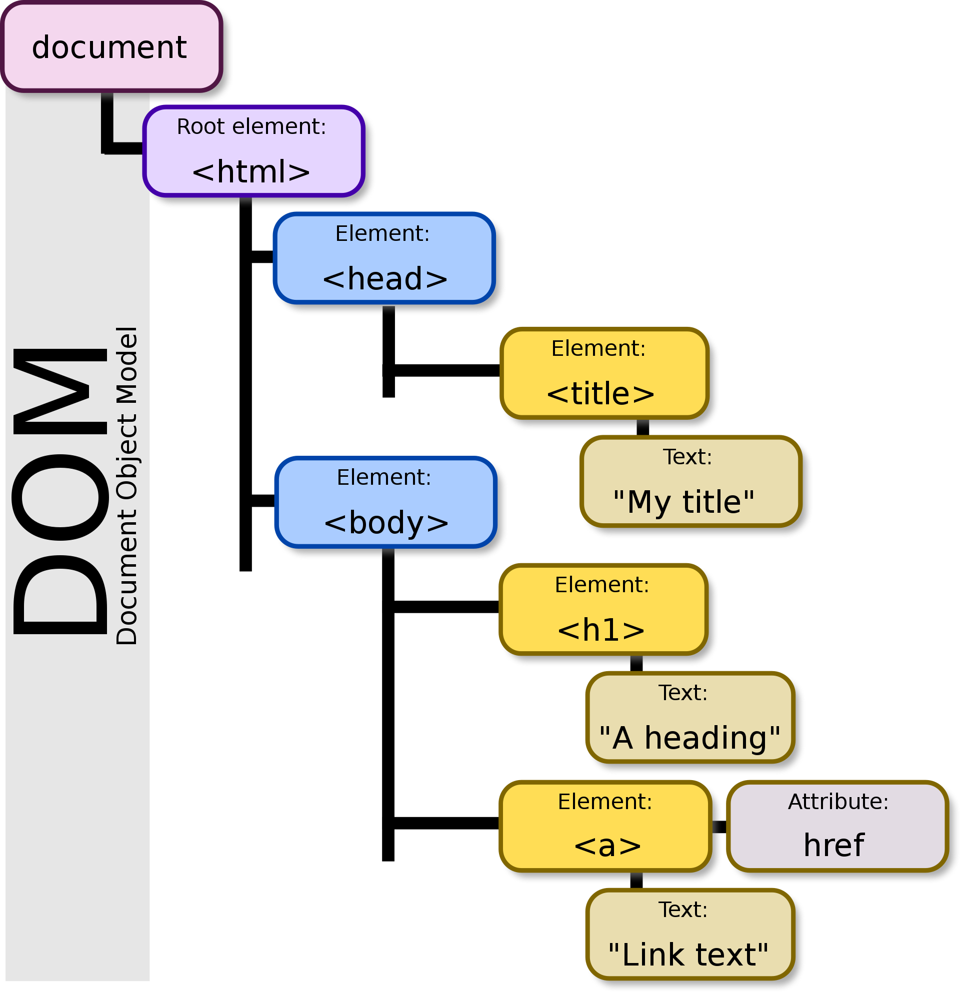
- You can define selectors based on element location within the DOM (Document Object Model)
What Do We Mean By Location?
- Browser turns HTML into the DOM
- Specify a selector based on where the HTML is
- Examples: House address/directions
Location-based Selectors: Relationship
- Directions: Instead of north & south, use relationships (like a family tree)
- Relationships: child, parent, sibling, descendant, ancestor
Location-based Selectors: Relationship
- Child: Direct descendant
- Parent: Direct ancestor
- Sibling: Same parent
- Descendant: Any descendant
- Ancestor: Any ancestor
Location-based Selectors
            <ul>

              <li>

                <em>Most important item</em>

              </li>

              <li>

                Second most important item

              </li>

            </ul>
            li em {

                  color: lime;

            }
A Closer Look at the CSS
            li em {

                  color: lime;

            }
- Space means: "select all em elements that has li as an ancestor & make the text color lime-green "
Results:
- Most important item
- Second most important item
Combinators
- Fancy word meaning to combine selectors
- Combining selectors allow us to apply styles as broadly or as specifically as we need
- There are three combinators:
- Descendant
- Child
- Adjacent sibling
Descendant combinator
- Uses space between two selectors
- Our example before had a path ul li em
- Descendant combinator looks like:
            ul em {

                  color: lime;

            }
Child combinator
- Must be an exact child path
- Uses > between two selectors
- Child combinator looks like:
            li > em {

                  color: lime;

            }
            <!-- This path does not exist -->

            ul > em {

                  color: lime;

            }
Adjacent sibling combinator
- Must be an exact sibling path (next to each other)
- Uses + between two selectors
- Can be dissimilar elements (such as h1 + p)
Adjacent sibling combinator
            li + li {

                  color: lime;

            }
Pseudo-class Selectors
- Also known as State-based selectors
- Allows us to style elements based on their state
- Syntax is a single colon: selector : state
Pseudo-class Selectors
- :hover
- :active
- :focus
- :visited
Pseudo-class Selectors Example
            button:hover {

                  color: lime;

            }
            a:visited {

                  color: red;

            }
Pseudo-Elements
- Pseudo-element is an extension of a CSS selector that targets a specific part of an element
- Uses : : syntax
Example:
            p::first-letter {

                  color: lime;

            }
Check In....

Work Time
Presentation: https://bit.ly/kcwit-cc-css
Worksheet: https://bit.ly/kcwit-cc-worksheet

Property-Value Pair

Basic Properties & Their Values
- Units of Measurement
- Color
- Properties
Units of Measurement
- Absolute:
- a measurement that remains constant regardless of context
- Relative:
- depends on another value or context, so its size can vary based on different factors
Absolute
- pixels [px]
- There are other absolute units, but they aren't common
Relative
- Percent [%]
- rem / em
- vh / vw
Percent [%]
- Relative to parent element
- Can be used for width, height, margin, padding, font-size
Percent Example
            ul {

                  margin: 18px;

            }
            li {

                  margin: 100%;  // 100% of 18px = 18px

            }
rem / em
- EM: Relative to PARENT element
- REM: Relative to ROOT element
- If root element is 16px, 1rem for an element = 16px
- Can be used for width, height, margin, padding, font-size
vh / vw
- Relative to viewport height / width (% of viewport)
- Can be used for width, height, margin, padding, font-size
Color
- Keep accessibility in mind when selecting colors (provide enough contrast)
- Lighthouse is built into Chrome DevTools to see where accessibility can be improved
Color
- RGB
- Hexadecimal
RGB
- 3-digit RGB code
- Each digit represents 256 values (0-255)
- Each set of digits represents the intensity of a color (red, green, blue)
rebeccapurple
- rgb(102, 51, 153)
Hexidecimal Numbers
- Hexadecimal is a base 16 number system
- Each digit represents 16 values (0-9, A-F)
- Each pair of digits represents a color (red, green, blue)
red
- #ff0000
rebeccapurple
- hex: #663399
- rgba(102, 51, 153)
Quick Note About Hex
- You can use shorthand hex
- #ffffff = #fff
- #663399 = #639
Properties
- color
- background-color
- border-color
- outline-color
- box-shadow
- >300 different properties in CSS with ~ infinite values
Properties
- You don't have to remember them all, just how to look up a property or value
- https://developer.mozilla.org/en-US/docs/Web/CSS/Reference
- Each property has a specific set of valid values
The Cascade
- Order of CSS rules are important - there's an hierarchy to the cascade that determines which rules are applied
- Process of combining multiple stylesheets and resolving conflicts between different CSS rules and declarations
Source Order
- Later rules win over earlier rules (of the same specificity)
Specificity
- Algorithm that browsers use to decide which rule to apply when multiple selectors target the same element
- More specific rules win over less specific rules
Order of Specificity (lowest to highest)
- Universal selector (*)
- Element selectors (p, h1)
- Classes (.myClass)
- IDs (#myId)
- Combining selectors to make rules more specific
- !important (WARNING: Overrides all other rules. Bad practice.)
Specificity Example
<h1 class="gif" id="ryan-gosling">Hey Girl!</h1>
            h1 {

                  color: red;

            }

            .gif {

                  color: blue;

            }

            #ryan-gosling {

                  color: green;

            }
What color will 'Hey Girl!' be?
Hey Girl!

Inheritance
- Children inherit traits from their parents: height, eye color, hair color, etc.
- Parent's properties may be inherited by child element
- If you don't specify a property for an element, it will inherit the value from its parent
Inheritance Example
            <div class="parentDiv">


                Parent div


                <div class="childDiv">

                    Child div

                </div>


            </div>
            .parentDiv {

                  color: yellow;

            }
Parent div
Child div
Inheritance Example
            <div class="parentDiv">


                Parent div


                <div class="childDiv">

                    Child div

                </div>


            </div>
            .parentDiv {

                  color: yellow;

            }

            .childDiv {

                  color: black;

            }
Parent div
Child div
Note About Inheritance
- Don't build your champagne fountain on a waterbed
- Start styling by elements (such as <body> or <h1>)
- Then override by adding more specificity

Work Time
Presentation: https://bit.ly/kcwit-cc-css
Worksheet: https://bit.ly/kcwit-cc-worksheet

Box Model & Layout

Box Model
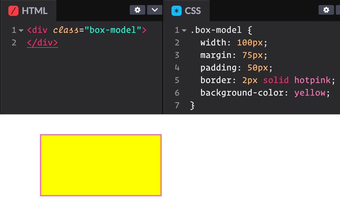
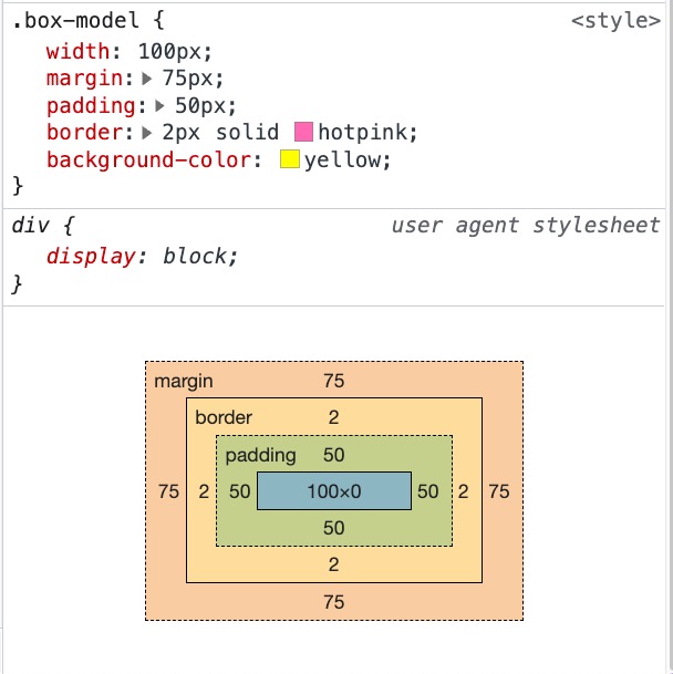
- Every element on a page is a rectangular box
- Spacing inside the box, outside the box, and the cardboard itself takes up space
- Box has 4 parts: content, padding, border, margin
- Can be styled with CSS
The Box Model in Terms of Pizza
- Content: the pizza
- Padding: the space between the pizza & the box
- Border: the cardboard box
- Margin: the space outside the pizza box (and the space between the pizza box and another box)

CSS Box Model
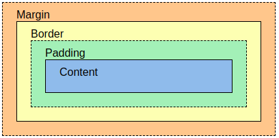
See how it breaks down
Box Model Properties
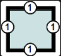
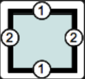
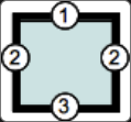
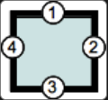
- Each spacing property can be broken up for each side of the box
1-value Syntax
All edges
margin: 1px;
2-value Syntax
Vertical/Horizontal
margin: 1px 2px;
3-value Syntax
Top/Horizontal/Bottom
margin: 1px 2px 3px;
4-value Syntax
Top/Right/Bottom/Left (Clockwise)
margin: 1px 2px 3px 4px;
Source:
https://developer.mozilla.org/en-US/docs/Web/CSS/Shorthand_properties
Basics of Layout in CSS
- Layout is the arrangement of elements on a page
- Display property
- Inline vs. Block
- None vs. Visibility
Layout Systems
- Most sites use layout systems
- More advanced than basic CSS layout, and enables responsive design
- Early days of the internet, developers used HTML tables for layout, which can be problematic
- Limited layout
- Not responsive
- Not accessible
Layout Systems
- Flexbox
- Grid
Advantages of Flexbox and CSS Grid
- Handles complex layout needs
- Manages wrapping and flexibility across various display sizes (phones, smart displays, tablets, big tv's)
- Providing maintainable code without needing workarounds or hacks
- Now the standard way of adding layout
1-dimensional Layout
- Use CSS Flexbox
- Elements lay out next to each other in either row or column (but not both)
- Elements can wrap to multiple rows or columns
- Example:
https://codepen.io/chriscoyier/full/PoPwPbE
2-dimensional Layout
- Use CSS Grid
- Elements lay out horizontally and vertically from each other in both rows and columns
- Used more often
- Example:
https://codepen.io/chriscoyier/full/ZEpPWKO
Flexbox & Grid
- Flexbox is 1-dimensional
- Grid is 2-dimensional
- They are not an either/or layout system
- You can use BOTH when styling
CSS Grid Nom Nom Gallery
https://codepen.io/ramenhog/full/MpORPa
- Shows grid with defined height (1st row) and dynamic heights (3rd row and on) in masonry pattern
- Responsive
- Type of layout is very painful without grid
- Flexbox handles the responsiveness
How to Use a Layout System
- HTML: Create a parent container with a class to style
- CSS: Define the styling to add grid and/or flexbox
HTML
- Common parent containers:
main, header, footer, form, section, article, div
            <section class="container">

              <!-- Child elements here -->

            </section>
CSS
- In the styles for the container, add the following:
display: grid;display: flex;
            .container {

              display: grid;

            }
Work Time
Presentation: https://bit.ly/kcwit-cc-css
Worksheet: https://bit.ly/kcwit-cc-worksheet

Wrap Up

Text & Icons

Common CSS Properties for Text
- color
- text-align
- font-size
- font-family
font-family
- Find fonts online (such as Google fonts, which is free)
- Link in HEAD or use @import
- List preferred web safe font and a backup:
- Use quotes for fonts with two words:
font-family: Roboto, sans-serif;
font-family: "Gochi Hand", cursive;
Icons
- Find icons online (such as Font-Awesome, Google icons, or Heroicons)
- Link in HEAD or use @import
Font-Awesome
- Once included in your project, use class name `fas fa-code` for the code icon in your html
- Use `::before` pseudo element to add the icon
CSS Frameworks
- Many development teams use CSS frameworks instead of writing their own CSS
- Collection of pre-written CSS code that you can use to style your website with pre-defined styles
- Some CSS frameworks allow for customization
- Useful for quickly styling a website
Why Use CSS Framework?
- Allows developers to focus on application features rather than styles
- Styling sites becomes much faster
- CSS frameworks are designed to be responsive
- Downside:
Learning curve of learning the styles of the framework
How Does This Work?
- Import the framework into your site:
              <!doctype html>

              <html>

                <head>

                  <meta charset="UTF-8">

                  <meta name="viewport" content="width=device-width, initial-scale=1.0">

                  <script src="https://cdn.tailwindcss.com"></script>

                </head>

              </html>
How Does This Work?
- Use the styles provided by the framework:
              <h1>Hello world!</h1>


              <h1 class="text-3xl font-bold underline text-pink-500 background-pink-50">

                  Hello world!

              </h1>
Hello world!
Hello world!
Popular CSS Frameworks
- CSS Bootstrap
- Tailwind
- Material UI
- Bulma
Awesome CSS
- CSS can be mind-blowing
- Check out some incredible examples:
- #CSSis {beautiful}
- Book cover opening/closing: code and live site
- Rolling Coke Can

Resources & Homework Ideas
Play Games to Learn More About CSS
Take a Free Course
What's Next
- Network!
- Take the quiz
- Join Slack
- Finish tonight's worksheet
- Find an online tutorial on Front End Architecture
- Register for next month's event

Keep up with us
codingandcocktails.kcwomenintech.org




#LadyDevs #KCWiT
#CodingAndCocktailsKC
Register for October's Intro To JavaScript Class:

